Have you ever looked at a brand and immediately felt that it was elegant, playful, modern, or traditional? That impression does not come from colours and logos alone. Typography in branding also plays a major role in shaping how people see and remember a business.
Imagine seeing the same brand name written in two different typefaces. One uses a refined serif with delicate strokes, while the other uses bold, rounded letters. Even though the words are identical, the two designs communicate very different personalities.
This is why choosing fonts for branding requires more thought than simply finding a typeface that looks attractive. The right typography should reflect what a brand represents, connect with its audience, and work consistently across different applications.
Why Typography in Branding Matters
Typography is more than a way to display words. It is a visual communication tool that helps businesses express their identity and create a recognizable style.
From a company logo to a website headline, every typographic choice contributes to how people experience a brand. Here are four ways typography supports effective branding.
It Communicates Brand Personality
Every typeface has its own visual characteristics. Some appear elegant and refined, while others feel bold, friendly, or expressive.
These characteristics influence how people interpret a brand. A fashion label might choose a high-contrast serif to create a sophisticated appearance, while a children’s product brand may prefer rounded or playful lettering.
The connection between typography and brand personality is not a fixed formula. A font does not automatically make a brand feel luxurious or friendly. Its effect depends on the design, colours, layout, and context in which it appears.
It Helps Build Brand Recognition
Consistency makes a brand easier to recognize across different platforms.
When a business uses the same typographic style in its logo, website, packaging, and promotional materials, it creates a more connected visual identity. Over time, audiences may begin to associate those distinctive letterforms and typographic treatments with the brand.
Typography works alongside other visual elements, such as colours and graphic symbols, to strengthen this recognition.
It Creates Visual Hierarchy
Not all information in a design has the same importance. A headline should attract attention, while supporting text should remain easy to read.
Typography creates this distinction through differences in size, weight, style, and spacing. A clear hierarchy helps readers understand information without having to work through every element at the same visual level.
It Maintains Visual Consistency
A brand appears in many places, from websites and social media to packaging and printed materials. Without a consistent typography approach, these applications can start to look disconnected.
A defined set of typefaces and usage rules helps keep the visual identity coherent. This is especially useful when several designers or teams work on the same brand.
Also Read : What Is Brand Identity?.
How Typography in Branding Shapes Brand Identity
Why can two fonts create such different impressions? The answer lies in their letterforms and the details of their construction.
Understanding these characteristics makes typeface selection more intentional. Instead of choosing a font based only on appearance, designers can evaluate how its structure supports the intended visual direction.
Letter Shapes and Proportions
The shape and proportion of letters influence the overall appearance of a typeface.
Some fonts have wide, open letterforms, while others use narrow and compact proportions. Rounded shapes can create a softer impression, whereas sharp angles may give a design a more structured appearance.
These details become particularly noticeable in logos and large headlines, where individual letterforms receive more visual attention.
Stroke Weight and Contrast
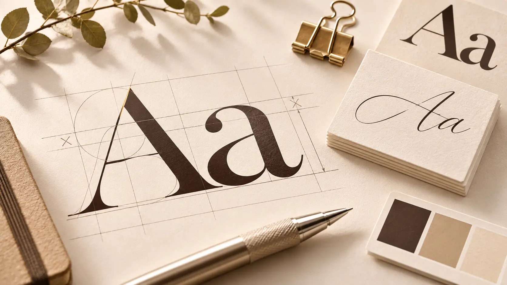
Stroke weight refers to the thickness of a letter’s lines. Typefaces may offer light, regular, medium, and bold styles, each serving different visual purposes.
Contrast describes the difference between thick and thin strokes within a letter. High-contrast serif fonts often have a more dramatic appearance, while low-contrast designs tend to look more uniform.
Reverse-contrast typefaces take a less conventional approach by reversing the expected relationship between thick and thin strokes. This can create a distinctive display style.
Terminals and Decorative Details
Terminals are the ends of strokes that form parts of letter shapes. They may be sharp, rounded, curved, or decorated depending on the typeface design.
Although these details can seem small, they contribute to a font’s character. A typeface with elaborate terminals may feel more expressive, while simpler letter endings can create a restrained appearance.
Spacing and Letter Rhythm
Spacing affects how individual letters and words work together.
Kerning adjusts the space between specific letter pairs, while tracking controls the overall spacing across a selection of text. Word spacing determines the distance between separate words.
Good spacing helps create a balanced composition. It also improves readability and makes typography look more considered, particularly in logos, headlines, and short display text.
Choosing the Right Fonts for Branding
There are thousands of typefaces available, so where should you start?
A useful approach is to begin with the brand rather than the font. Understand what the business wants to communicate, who it wants to reach, and where the typography will appear.
Start With Your Brand Personality
Identify a few characteristics that describe the brand. Is it elegant, playful, bold, traditional, minimal, or expressive?
These qualities provide a starting point for exploring suitable typefaces.
For example, a beauty brand with a refined visual direction might explore serif typography, while a creative lifestyle brand may benefit from a more expressive script or display style.
However, these are starting points rather than strict rules. The best choice is the one that supports the brand’s overall direction.
Consider Your Target Audience
Think about the people who will interact with the brand.
A typeface should feel appropriate for its intended audience and the context in which they encounter it. A design aimed at a professional audience may require a different visual approach from one created for children’s products.
Readability also matters. A highly decorative typeface may attract attention, but it can become difficult to read when used for longer descriptions or smaller text.
Think About Where the Font Will Be Used
A typeface that works beautifully in a large logo may not perform as well in a website paragraph.
Consider the different applications before making a final decision:
- Logos: Distinctive letterforms that support the brand’s visual character.
- Packaging: Typography that communicates product personality while keeping essential information readable.
- Websites: Clear typefaces that work across different screen sizes.
- Social media: Expressive headlines and short messages that attract attention.
- Editorial materials: Comfortable reading experiences with a clear typographic hierarchy.
Testing a font in its intended applications can reveal limitations that are not obvious when viewing a specimen alone.
Evaluate the Typeface as a Complete Design
Look beyond the appearance of a few individual letters. Examine the entire character set, including uppercase and lowercase letters, numbers, punctuation, and available styles.
Consider whether the font offers the weights and language support your project requires. Also check its licensing terms to ensure that the intended commercial uses are permitted.
Good typeface selection considers both design quality and practical requirements.
How Do You Build a Consistent Brand Typography System?
Choosing one attractive font is only the beginning. A brand needs a system that explains how typography should be used across its visual materials.
A brand typography system defines the typefaces, styles, and hierarchy that guide consistent design decisions.
Choose a Primary Typeface
The primary typeface is one of the main fonts associated with the brand. It may appear in the logo, headlines, or other prominent applications.
Its visual character should reflect the brand’s personality and work well in the contexts where it will be used most often.
Select a Supporting Typeface
A secondary typeface provides flexibility and contrast.
For example, a decorative serif may work well for headlines, while a simpler typeface handles body text and supporting information. This combination allows the brand to express personality without sacrificing readability.
Not every brand needs several font families. A carefully selected typeface with multiple weights may be sufficient for a simple visual identity.
Establish a Clear Typographic Hierarchy
A consistent hierarchy defines how different levels of information should look.
A basic system may include:
- Headings: Main titles and prominent messages.
- Subheadings: Supporting sections and secondary information.
- Body text: Paragraphs and longer descriptions.
- Captions: Labels, notes, and additional details.
Define the font family, size, weight, and spacing for each level. This gives designers a practical reference when creating new materials.
Use Font Pairing With a Clear Purpose
Font pairing for branding involves combining typefaces that complement each other.
A successful combination usually creates enough contrast to distinguish different roles while maintaining a coherent visual direction.
Some combinations worth exploring include:
- Serif and sans serif: A balance between expressive headlines and simple supporting text.
- Serif and script: A combination that can introduce elegance and a personal touch.
- Display and simple typeface: A distinctive headline style supported by readable text.
Avoid choosing fonts simply because they look different. Their proportions, visual weight, and overall character should work together.
What Typography Mistakes Should Brands Avoid?
Even a well-designed typeface can become ineffective when used without a clear purpose. Here are some common mistakes to watch out for.
- Using too many typefaces: Too many unrelated fonts can make a brand look inconsistent. Start with a small, purposeful selection.
- Choosing fonts based only on appearance: A visually attractive font may not suit the brand’s audience or practical needs.
- Ignoring readability: Decorative typefaces are often better suited to short text than long paragraphs.
- Using inconsistent styles: Changing typography without clear rules can weaken the visual connection between brand materials.
- Overlooking spacing: Poor kerning, tracking, and line spacing can make text feel unbalanced.
- Ignoring font licensing: Always check the licence before using a typeface in commercial projects.
The goal is not to use the most unusual font available. It is to select typefaces that work together and support the brand’s communication.
Bringing Typography Into Real Brand Applications
Understanding typography becomes easier when you see how different typefaces work in a real design context.
Consider three fictional brand concepts that use different typographic directions.
An Elegant Beauty Brand
Imagine a skincare brand that wants to communicate sophistication and refinement.
A serif typeface such as Milyuna Serif could serve as the main display font for the brand name and prominent headlines. A signature-style font such as Anantha Signature could introduce a decorative accent in selected applications.
This combination could work across product packaging, website headings, and editorial materials. The key is to use the script style selectively so that it complements rather than competes with the primary typeface.
A Playful Children’s Brand
A children’s brand may need a visual identity that feels cheerful, friendly, and expressive.
Lazy Meow Display could provide a distinctive style for the brand name, packaging headlines, and promotional graphics. A simpler supporting typeface would help keep product descriptions and other information readable.
This approach allows the brand to express personality while maintaining clarity.
A Vintage Coffee Brand
A coffee brand inspired by traditional cafés may benefit from a nostalgic visual direction.
Godiva Vintage could be used for the brand name and prominent packaging elements. A simpler supporting font could handle product descriptions, menus, and other practical information.
The result could combine decorative character with a functional typography system.
These concepts illustrate how typeface selection depends on the brand’s personality and intended applications. A font should not be selected in isolation; it should contribute to a complete visual identity.
Build a Brand Identity That Speaks Through Typography
Typography and brand identity are closely connected. The typefaces a business chooses can influence how its personality is communicated, how its materials are recognized, and how consistently its visual identity appears across different platforms.
There is no single typeface that works for every brand. The right choice depends on the business, its audience, and the message it wants to communicate.
By understanding letterform characteristics, making thoughtful typeface selections, and establishing a consistent brand typography system, designers can create visual identities that feel more distinctive and purposeful.
If you’re exploring typefaces for your next creative project, explore our font collection and discover typefaces that can bring your brand’s visual character to life.